
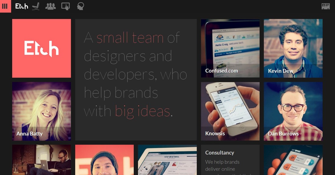
I really liked THIS website because it breaks the traditional look of websites, and goes for something completely out of the box. This website has several boxes in fact, with pictures of different people and things breaking up the just boxes look. If there were anymore boxes, I would say it was very busy, but the combination of big boxes, which have the important messages and images that quickly get the point across, it makes a prefect balance of too little and to much. To better get their point across, the words they really wanted you to remember were highlighted red, it's overall very sleek and nice.
So what do you think of the simple feel? When you first opened up the website, could you tell immediately what the website was trying to say? Which principles of design do they use? Explain why. Please leave a comment below sharing your thoughts! :D
So what do you think of the simple feel? When you first opened up the website, could you tell immediately what the website was trying to say? Which principles of design do they use? Explain why. Please leave a comment below sharing your thoughts! :D
NOTE: You get ONE FREE POINT on your chapters 5 and 6 quiz if you post a thoughtful comment on week 5 AND 6's "Website Wednesdays" blog posts. Your comment needs to answer the questions that Jessica addressed above.


 RSS Feed
