Check out this sweet online portfolio of a music producer at timpalmer.com. FYI - music will be playing when you open the link!
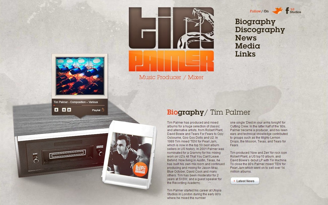
One of my favorite aspects of this website is that the user (you) immediately knows what kind of work Tim Palmer does through samples of his music and an image of a cassette player. I really like the big logo and the grungy feel of the website. I also think it has really good layout, meaning that the contents of the page are positioned really well and interestingly. Another one of my favorite things about this website is the navigation - go see what I mean and let me know if you agree!
Do you like the website? Does it make you want to check out his work? How do you like the colors? The logo? The navigation? The font? Do you think this sort of Web site draws the user in? Share with me your thoughts!
NOTE: You get ONE FREE POINT on your chapters 4 and 5 quiz if you post a thoughtful comment on weeks 3, 4, and 5's "Website Wednesdays" blog posts. Your comment needs to answer the questions that I addressed above.

 RSS Feed
