If you want a little inspiration today, then feel free to check out this video that I made last year when I visited New York City with some friends. I watched it today and was reminiscing on how incredible it was. If you haven't been, then you've got to go someday. It's my favorite city. Everything about it inspires me!
 Hey guys! I can't believe the school year is almost over! It's crazy how time flies. I can imagine that a quite a few of you are excited for it to be over. Well, why don't you take a break and check out THIS website. Cupcakes are world famous, and this website specializes in them. I love the slide show of cupcakes, and I love how the top of the website looks like a bakery shade. As you'll probably notice this website is in French. So what do you think of the colors? Do you think they followed any of the principles of design? If you were in France, would you try to get these cupcakes? Was the website designer effective in getting his or her message across? Lemme to know in a comment below! :) 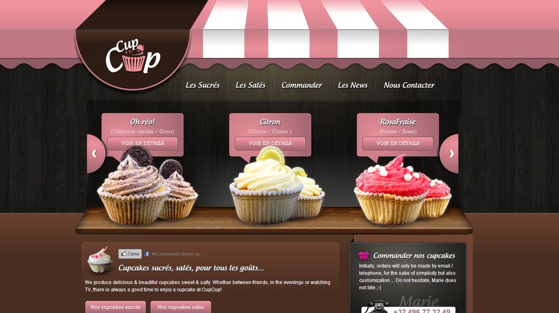
NOTE: You get ONE FREE POINT on your chapters 3 and 4 quiz if you post a thoughtful comment on week 3 and 4's "Website Wednesdays" blog posts. Your comment needs to answer the questions that Jessica addressed above.
 Hey guys! It's your friendly T.A. here. This week's Website Wednesday is a site for a restaurant. I love how the site has kind of a African....natural...feel to it. The wood background, and spices and bits of spices here and there all help with the feel. Even the text has this feel to it. What do you think of the navigation of the site? Do you think it's "user friendly"? Would you go to this restaurant? What do you think of the colors? What would you change? Let me know in a comment below! Jessica out. 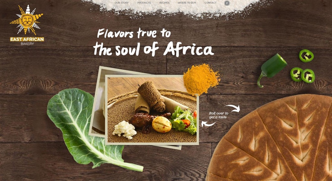 NOTE: You get ONE FREE POINT on your chapters 3 and 4 quiz if you post a thoughtful comment on week 3's "Website Wednesdays" blog post. Your comment needs to answer the questions that Jessica addressed above.
 For this weeks website Wednesday, I found a website that had a really simple, but dramatic effect when you first opened it up. I loved the way that they had these colors that were kinda like saying, this is a "cool" website, professional, ect. Then in the midst of these colors they had their logo. Giving a very strong message, with almost no words. Then they kept this color scheme through out the whole website bring the whole thing together, and giving it a feel of professionalism. If you scroll down from the front picture, you can see some websites that have been created by this web designer. Again, creating a very clear message with no words. If you were to create a website about yourself as a web designer, what kind of methods would you use to get the message across about you're self? Would you use as strong of a message as this web designer did? Is there anything you wish to change? Let me know in the comments below! :D 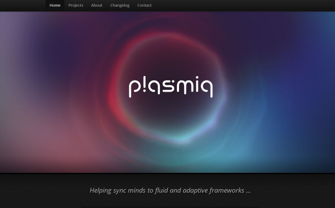
NOTE: You get ONE FREE POINT on your chapters 1 and 2 quiz if you post a thoughtful comment on week 2's "Website Wednesdays" blog posts. Your comment needs to answer the questions that Jessica addressed above. (There was no Website Wednesday for week 1)
-Blogs
-Reminders
Wow, I love reading all of your course feedback - it's always very informative and positive, which makes it so much easier for me to improve my teaching and curriculum each quarter. I'm ecstatic to hear that you are really enjoying the class. Please do not ever hesitate to come to me if you ever need help or even if you want to chat for a bit about anything random ;). I absolutely love teaching this class and I have such a stellar group of students this year and I can already see lots of Web Designers in the making. Thank you for a great quarter and I'm looking forward to the next.
Much love, Ms. H
Much love, Ms. Hansen |
Ms. HansenThis is Ms. Hansen's class blog. Check it out! Archives
March 2015
|
 RSS Feed
