
Hey there! It's another Website Wednesday with Jessica!
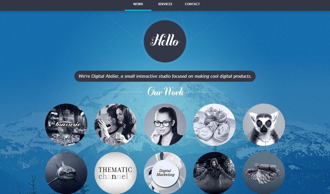
THIS has some really fun circles on the front page that change from black and white to colored when you scroll over them. Then there is a fun little circle with Hello on the top of the page. I love the circles because it's a really simple way of jazzing up a picture or some text. The background has a mountain, which has been tone down to the point where it just adds to the feel of the website. Quite a creative simple background. The website doesn't feel overwhelming which I also really love. It's very simple feel to it, but professional feel.
So what do you think of the simple feel? What about the words "Our work"? Do you think they blend into the background? If so, how would you fix that? When you first opened up the website, could you tell immediately what the website was trying to say? Please leave a comment below sharing your thoughts! :D
NOTE: You get ONE FREE POINT on your chapters 5 and 6 quiz if you post a thoughtful comment on week 5 AND 6's "Website Wednesdays" blog posts. Your comment needs to answer the questions that Jessica addressed above.
 RSS Feed
